P&P Cover
Pride and Prejudice Book Cover
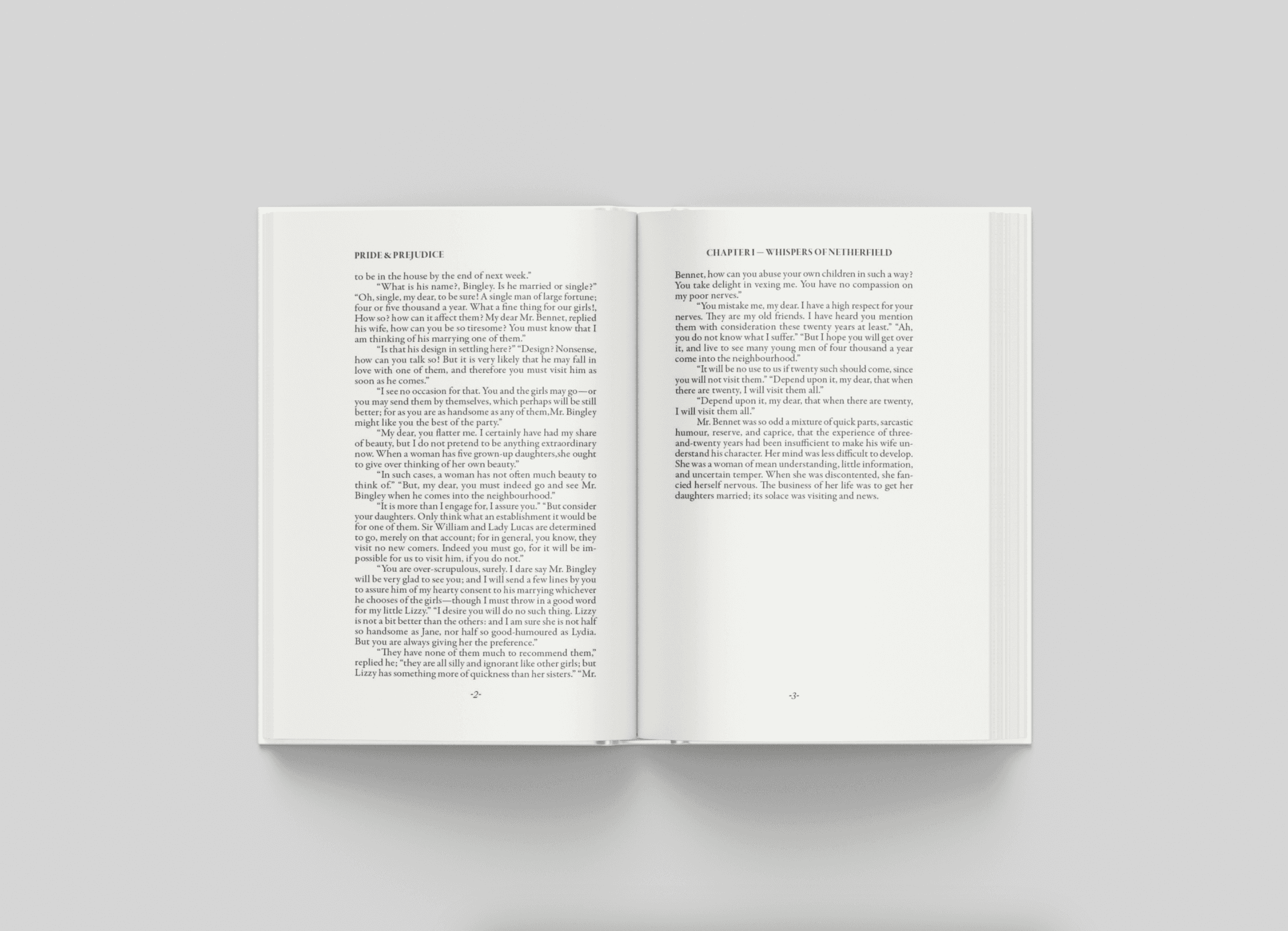
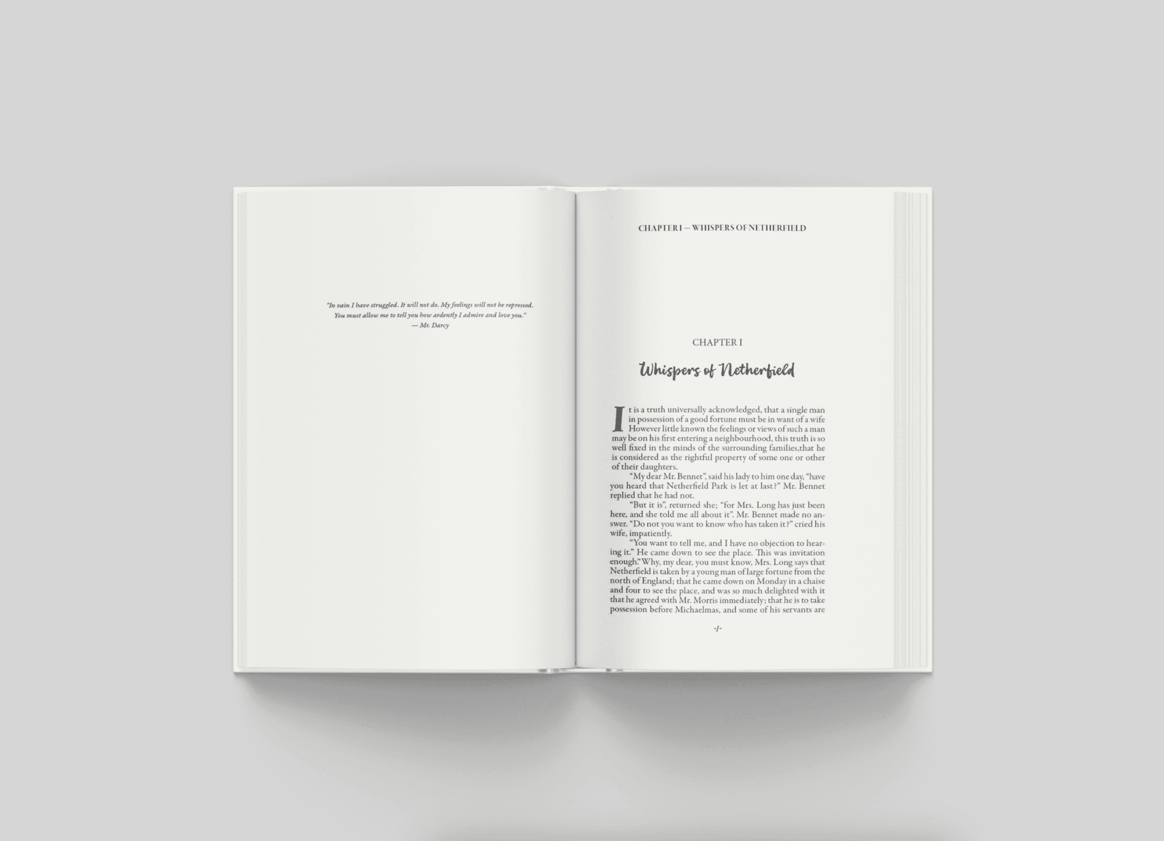
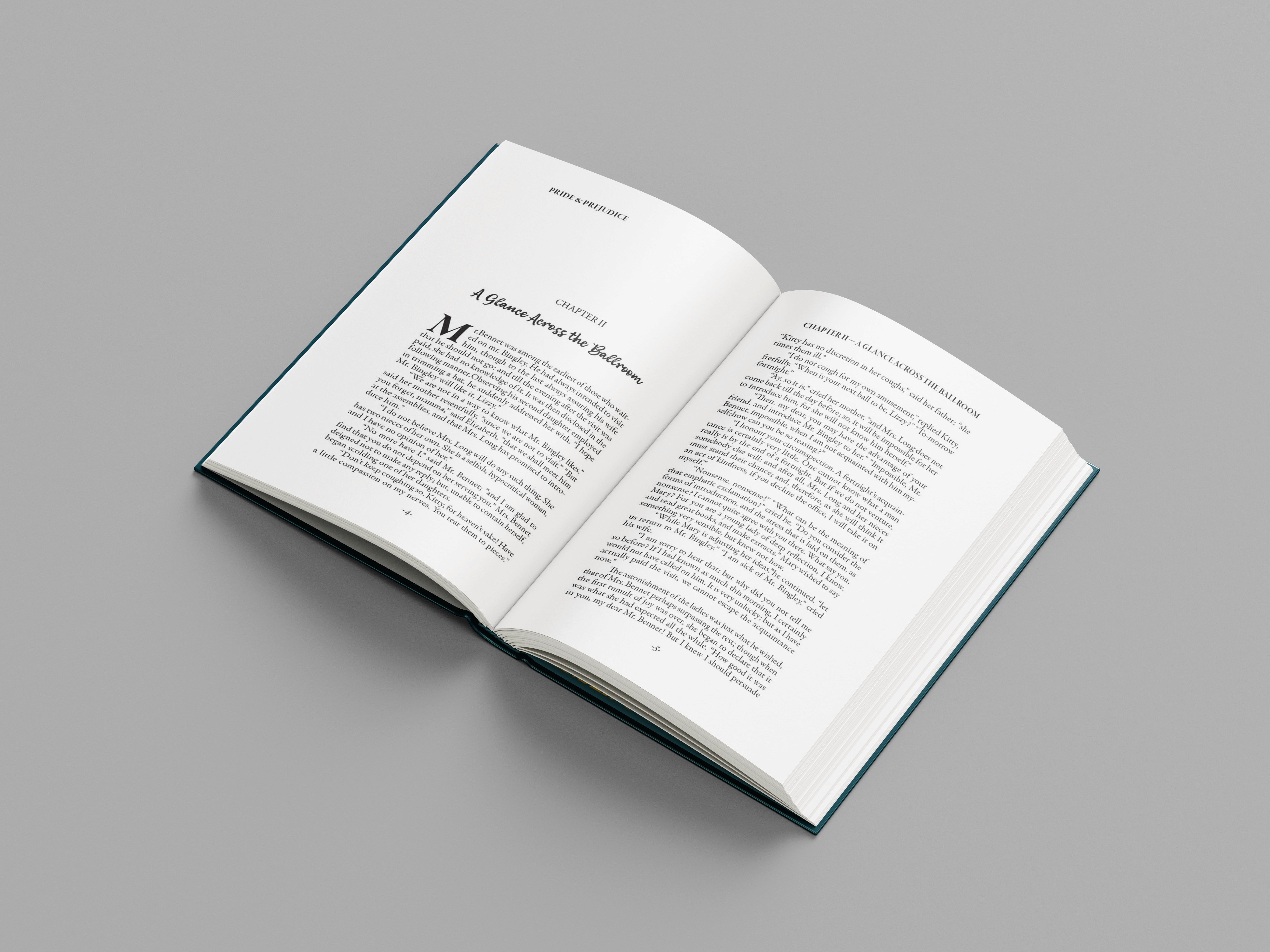
This project involved designing a contemporary book cover for Pride and Prejudice by Jane Austen. The goal was to reimagine the classic novel through expressive typography and thoughtful visual direction while preserving its historical and romantic essence. The design process included research, moodboard creation, hand-drawn sketches, font exploration in Illustrator, and defining a clear target audience before final execution.
Category
Illustration
Client
Typography Class
Services
Graphic Design
Year
2025
challenge.
Designing a cover for an iconic novel required balancing tradition with fresh interpretation. Key challenges included avoiding cliché imagery, combining period-inspired aesthetics with modern design sensibilities, and creating typography that communicates romance, social tension, and emotional depth. Additionally, the cover needed to appeal to a wide audience, from young adults to classic literature readers, while standing out among many existing editions.
solution.
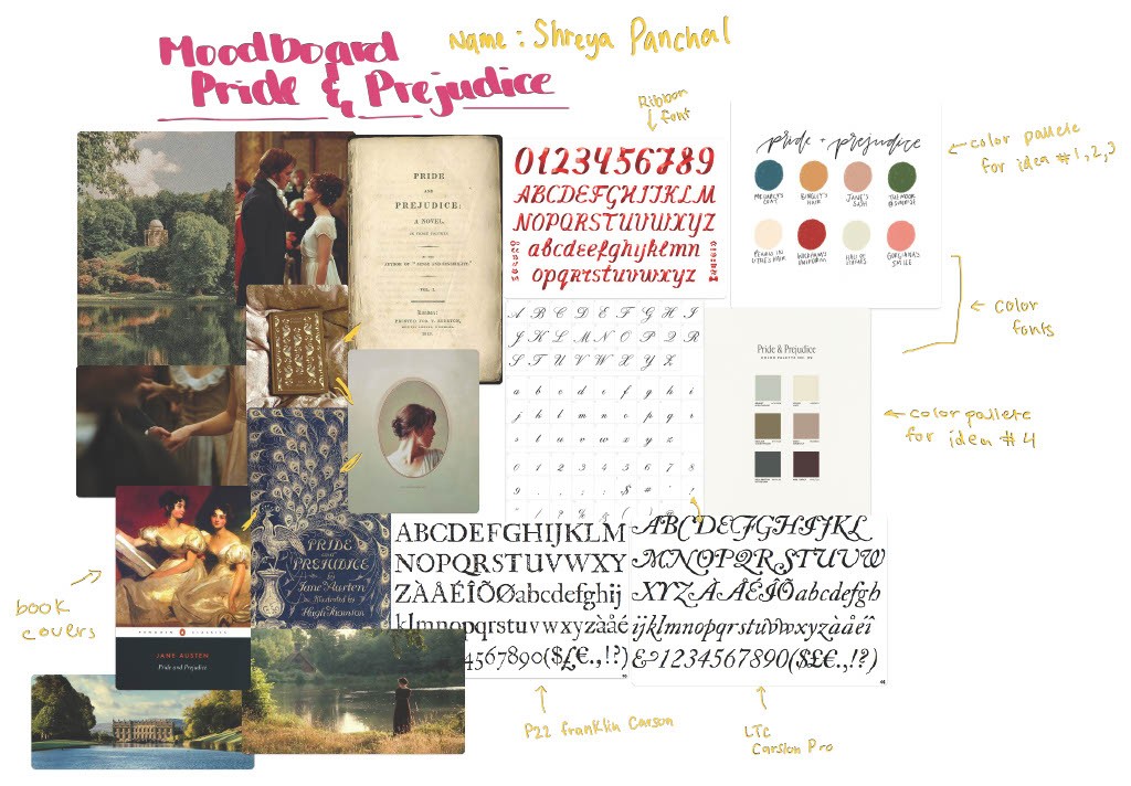
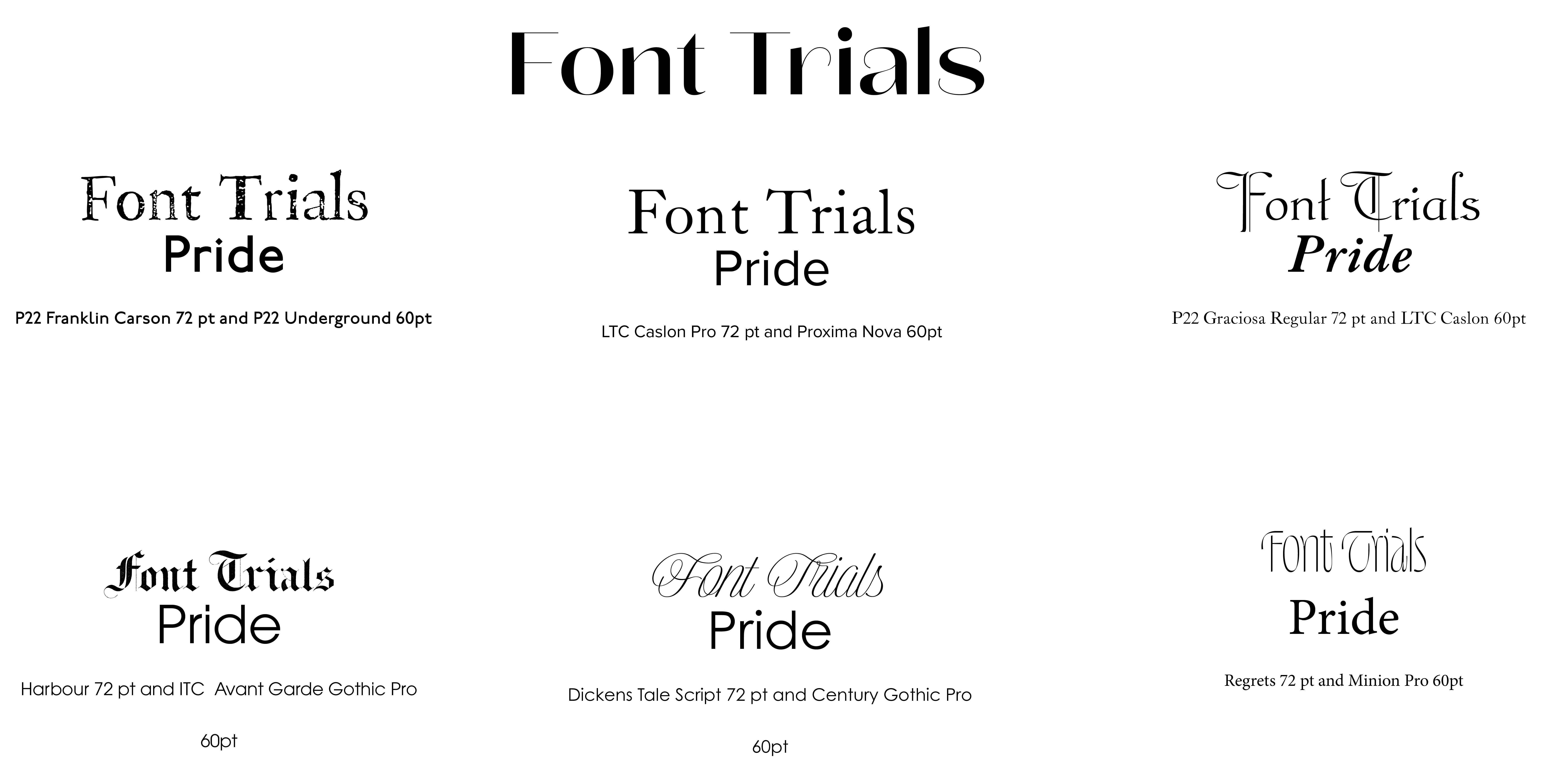
The solution focused on research-driven conceptual design. A moodboard established soft romantic tones, classic elegance, and refined serif typography to guide the aesthetic. Typography exploration emphasized hierarchy, letter spacing, and emotional expression, allowing type to carry the story’s tone. Choosing Pride and Prejudice enabled a stronger conceptual connection to the narrative, and every design choice aimed to balance historical respect with contemporary appeal.
results.
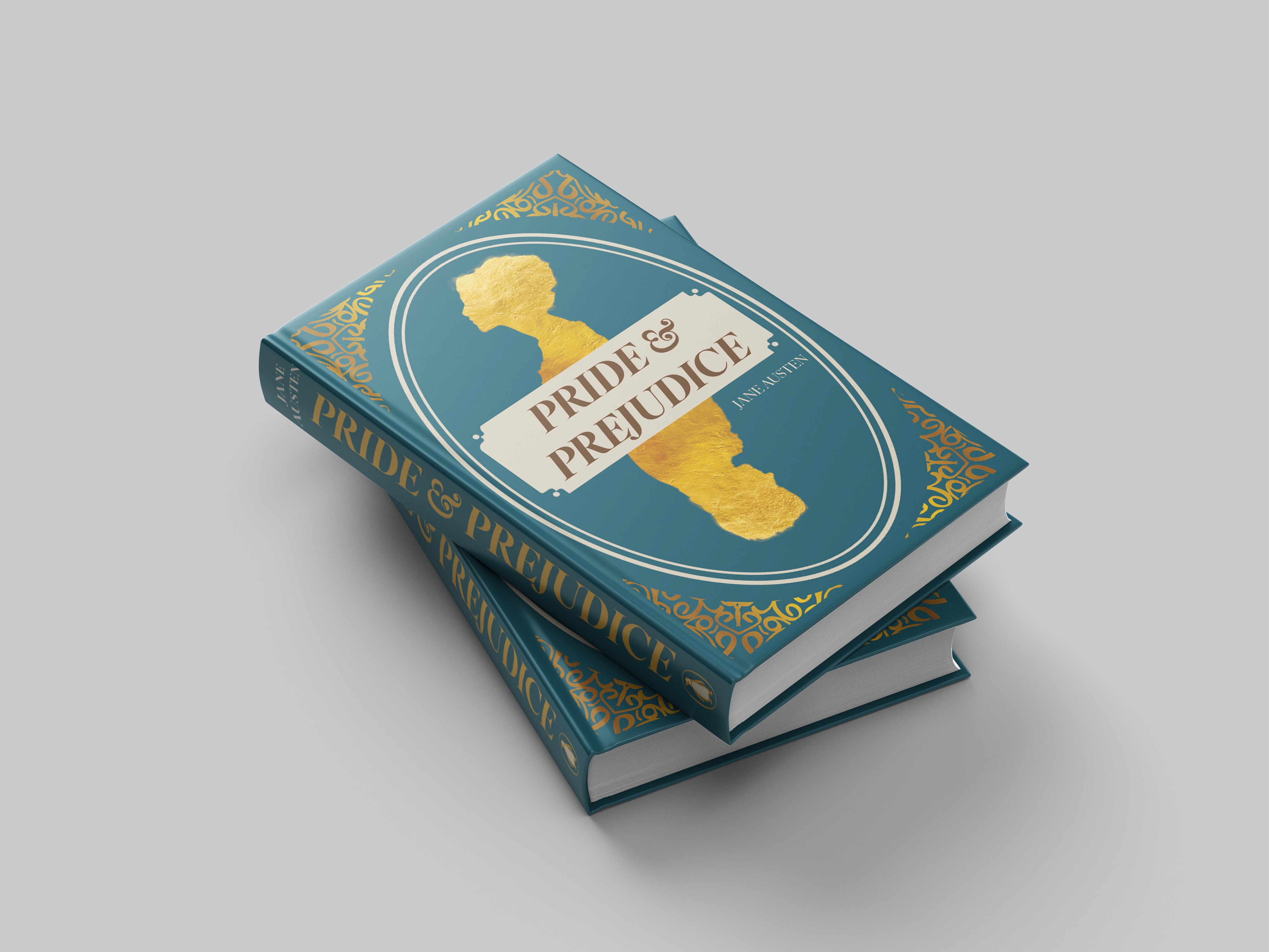
The final cover captures the novel’s romantic and refined tone while feeling contemporary and accessible to young adult and adult readers. Strong typographic hierarchy and cohesive visual direction highlight conceptual clarity. This project strengthened my skills in translating narrative themes into visual identity and reinforced the importance of research-driven design in literary projects.